A Year of Change
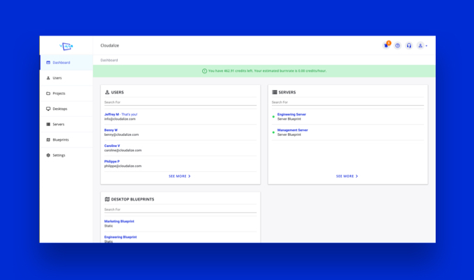
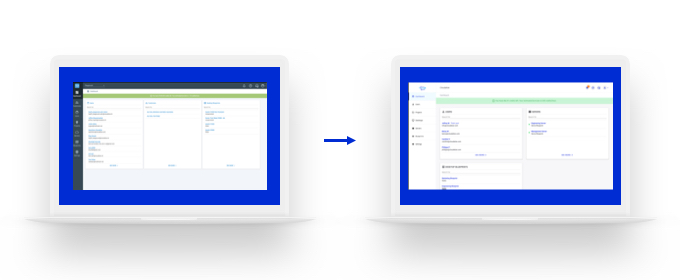
2019 is a year of change at Cloudalize. In January, we announced the launch of our new data centre in North America. Today, we announce a newly designed User Interface (UI).
The user interface is the first thing to be redesigned in the new and improved house style of Cloudalize. This marks a new and exciting chapter of the company.
When developing the new look of the interface, we kept you – as a user of our solution – foremost in our minds. We listened to the feedback received over the years and made the desired improvements .

Optimising UX
We know that the amount of tasks that you perform each day has increased dramatically. That’s why the Cloudalize team has focused on optimising the User Experience (UX). For example, the new interface features better responsiveness and visual contrast. This leads to more uniformity and consistency in the design.

Work better on any device
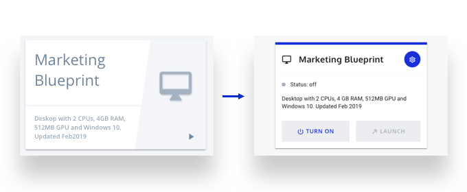
The updated UI has features which help to guide you through the platform to take the most appropriate action on any device. For example, the “Desktops” launch now has more visual call-to-action buttons making it easier to perform day-to-day tasks such as launch and switch on/off.

What’s next?
Optimising our customers’ user experience, for instance by developing and fine-tuning our user interface, is very important to us at Cloudalize. As such, the Development team are currently working on the next big update of the Cloudalize platform. Stay tuned for more later this year!
In the meantime, tell us about your experience of the new design. Email your Account Manager or contact us directly on Twitter or LinkedIn.
Author: Caroline Verellen

